In the modern marketplace, where thousands of products compete for a fleeting second of a consumer’s attention, the significance of first impressions cannot be overstated. While the quality of the product inside the container is what builds long-term loyalty, it is the exterior presentation that initiates the relationship. This is where custom labels step in as the silent ambassadors of your brand, conveying quality, personality, and professionalism without saying a single word. Designing high-quality custom labels is an intricate blend of artistic vision and technical precision, requiring a deep understanding of how different elements interact under various lighting and environmental conditions. A well-executed label does more than just list ingredients or provide a barcode; it tells a story and establishes an emotional connection with the buyer, making the difference between a product that remains on the shelf and one that finds its way into a shopping cart.
Understanding the Foundations of Label Material Selection
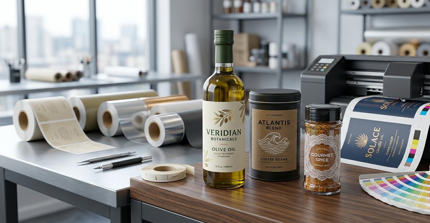
The journey toward creating a premium label begins long before a single pixel is placed on a digital canvas; it starts with the selection of the physical substrate. The material you choose for your custom labels acts as the skin of your product, and its texture and durability must align with the environment the product will inhabit. For instance, a product destined for a high-moisture environment, like a chilled beverage or a bathroom vanity, requires a synthetic material that can withstand condensation without peeling or blurring. On the other hand, a luxury organic skincare line might benefit from a textured paper stock that evokes a sense of earthiness and authenticity. Selecting the right base is a technical necessity that ensures the integrity of your branding remains intact from the warehouse to the consumer’s home.
The Durability of Film and Vinyl Substrates
When durability is the primary concern, film-based materials such as polypropylene or vinyl are the gold standard for custom labels. These materials are essentially plastic-based, making them resistant to water, oils, and even certain chemicals that would ruin a standard paper label in seconds. For products in the automotive, industrial, or outdoor sectors, vinyl provides a ruggedness that ensures the branding doesn’t fade or degrade under harsh UV rays. Beyond their strength, these materials offer incredible versatility in terms of clarity; clear film labels allow for a “no-label look,” giving the illusion that the design is printed directly onto the container itself, which is a popular trend in the craft soda and high-end spirit industries.
The Aesthetic Appeal of Textured Paper Stocks
For brands that want to communicate heritage, elegance, or artisanal craftsmanship, paper-based custom labels offer a tactile experience that plastic simply cannot replicate. Textured papers, such as felt, linen, or laid stocks, add a three-dimensional quality to the packaging that encourages the consumer to touch and interact with the product. These materials are particularly popular in the wine and gourmet food industries, where the subtle ridges and grains of the paper reflect light in a way that suggests a premium, hand-crafted origin. While paper is more susceptible to the elements, modern varnishes and coatings can be applied to provide a degree of moisture resistance without sacrificing the natural feel of the fiber.
Enhancing Visual Appeal Through Premium Finishes
Once the material is chosen, the next layer of design involves selecting finishes that elevate the visual and tactile impact of your custom labels. Finishes are not merely protective coatings; they are psychological triggers that influence how a consumer perceives the value of your brand. A matte finish might suggest a modern, sophisticated, and understated luxury, whereas a high-gloss finish screams energy, vibrancy, and mass-market appeal. The choice of finish can drastically alter the color profile of your printed design, either deepening the blacks for a dramatic effect or making the colors “pop” to grab attention from across a crowded retail aisle.
Matte vs Glossy: Choosing the Right Sheen
The debate between matte and glossy finishes for custom labels often comes down to the brand’s core identity. Glossy finishes are reflective and shiny, which naturally draws the eye and makes colors look more saturated and intense, making them ideal for snacks, toys, and products aimed at a younger demographic. Conversely, matte finishes eliminate glare and provide a soft, silky texture that feels sophisticated and expensive. In the world of high-end cosmetics and boutique coffee roasting, matte is often the preferred choice because it looks excellent under the harsh LED lighting of retail stores, ensuring that the brand’s typography remains legible from all angles without distracting reflections.
Adding Dimension with Spot UV and Foil Stamping
To truly separate a product from the competition, designers often turn to specialty finishes like spot UV and foil stamping. Spot UV involves applying a high-gloss coating to only specific parts of the custom labels, such as a logo or a particular pattern, creating a contrast between the flat background and the shiny raised elements. This technique adds a layer of physical depth that consumers can feel when they run their fingers over the packaging. Similarly, foil stamping—whether in gold, silver, or copper—adds a metallic brilliance that signifies prestige. These accents act as focal points, guiding the consumer’s eyes to the most important parts of the branding and instantly elevating the perceived price point of the item.
The Role of Color Theory and Typography in Impactful Design
Visual impact is heavily dependent on the harmonious relationship between color and typography. When designing custom labels, the color palette must be chosen with the target audience’s psychology in mind. Blue often evokes trust and reliability, making it a staple for pharmaceutical and cleaning products, while green is the universal shorthand for health and sustainability. However, color is only half the battle; the typography must be legible while also reflecting the brand’s voice. A bold, sans-serif font might communicate modern efficiency, while a delicate, hand-written script suggests a personal touch and intimacy. The challenge lies in balancing these elements so that the label is both beautiful and functional.
Ensuring Legibility and Hierarchy
A common mistake in the design of custom labels is trying to cram too much information into a small space, leading to visual clutter that confuses the consumer. Effective design relies on a clear visual hierarchy, where the most important information—usually the brand name and the product type—is the most prominent. Secondary information, such as weight, benefits, or flavor profiles, should be organized logically using smaller font sizes or different weights. By creating a path for the eye to follow, you ensure that the consumer can digest the most vital information in a fraction of a second, which is often all the time you have to make an impression in a retail environment.
Color Consistency Across Different Batches
One of the most technical challenges in producing high-quality custom labels is maintaining color consistency across different printing runs. A brand’s signature red or navy must look identical whether the label was printed in January or July. This requires a deep understanding of color spaces, moving from the digital RGB spectrum used in design software to the CMYK or Pantone Matching System (PMS) used in professional printing. Using PMS colors is particularly important for brands that require exact color matching, as it ensures that the physical ink used in the press matches the intended shade perfectly, preventing the brand from looking “off” or cheapened by inconsistent hues.
Practical Insights into the Printing and Application Process
Designing a beautiful label is only the first step; the final product must be printed and applied with precision to achieve a professional result. The printing method chosen—whether digital, flexographic, or offset—will depend on the volume of the order and the complexity of the design. Digital printing has revolutionized the industry by allowing for high-quality, full-color custom labels with low minimum order quantities, making it perfect for small businesses and seasonal product launches. However, for large-scale production, flexographic printing remains the most cost-effective solution, offering high speeds and the ability to use a wide variety of specialized inks and finishes in a single pass.
At the center of this logistical process is the need for a reliable partner who understands the nuances of the industry. For instance, companies like Attapack have streamlined the integration of high-quality packaging and labeling solutions, ensuring that the physical dimensions of the container and the technical specifications of the label work in perfect harmony. When you collaborate with experts who understand the synergy between the container and its “skin,” you avoid common pitfalls such as label flagging—where the edges of the label peel away from a curved surface—or ink scuffing during transit. Professional oversight during the transition from design to physical product ensures that the final result is as polished as the original concept.
Common Mistakes to Avoid in Label Design
Even the most creative designers can fall into traps that compromise the effectiveness of custom labels. One of the most frequent errors is ignoring the “bleed” and “safe zones” required for the printing process. If a design goes right to the edge of the label without a proper bleed, any slight shift in the cutting blade during production can result in unsightly white edges. Another common oversight is failing to consider the color of the product or the container itself. If you are using a clear label on a dark bottle, certain colors in your design might disappear or change hue significantly once applied. Testing your design on a physical mockup of the container is an essential step that should never be skipped.
The Future of Labeling: Sustainability and Innovation
As we look toward the future, the trend in custom labels is shifting heavily toward sustainability and interactive technology. Consumers are increasingly demanding eco-friendly packaging, leading to the rise of compostable materials, recycled paper stocks, and “wash-away” adhesives that make it easier to recycle glass and plastic containers. Furthermore, the integration of Augmented Reality (AR) and QR codes is turning static labels into gateways for digital experiences. A simple scan can lead a consumer to a video of the farm where the ingredients were grown or provide a curated playlist that complements the product. Innovation in labeling is no longer just about the physical look; it is about expanding the brand’s narrative into the digital realm.
Conclusion
The art of designing high-quality custom labels is a multifaceted discipline that requires a balance of aesthetic creativity, material science, and strategic marketing. By carefully selecting the right substrates, applying premium finishes, and adhering to the principles of color theory and typography, brands can create a powerful visual identity that resonates with their audience. Whether you are a small startup looking to make your mark or an established company refreshing your image, the investment in professional, well-thought-out labeling pays dividends in brand recognition and consumer trust. In a world of endless choices, a high-quality label is your best tool to ensure your product isn’t just seen, but remembered and cherished. Read more about Attapack.