Think about the last time you walked into an unfamiliar office. Before anyone spoke to you, you had already decided whether the place felt organized, creative, old-fashioned, or ambitious. You probably could not explain how you knew.

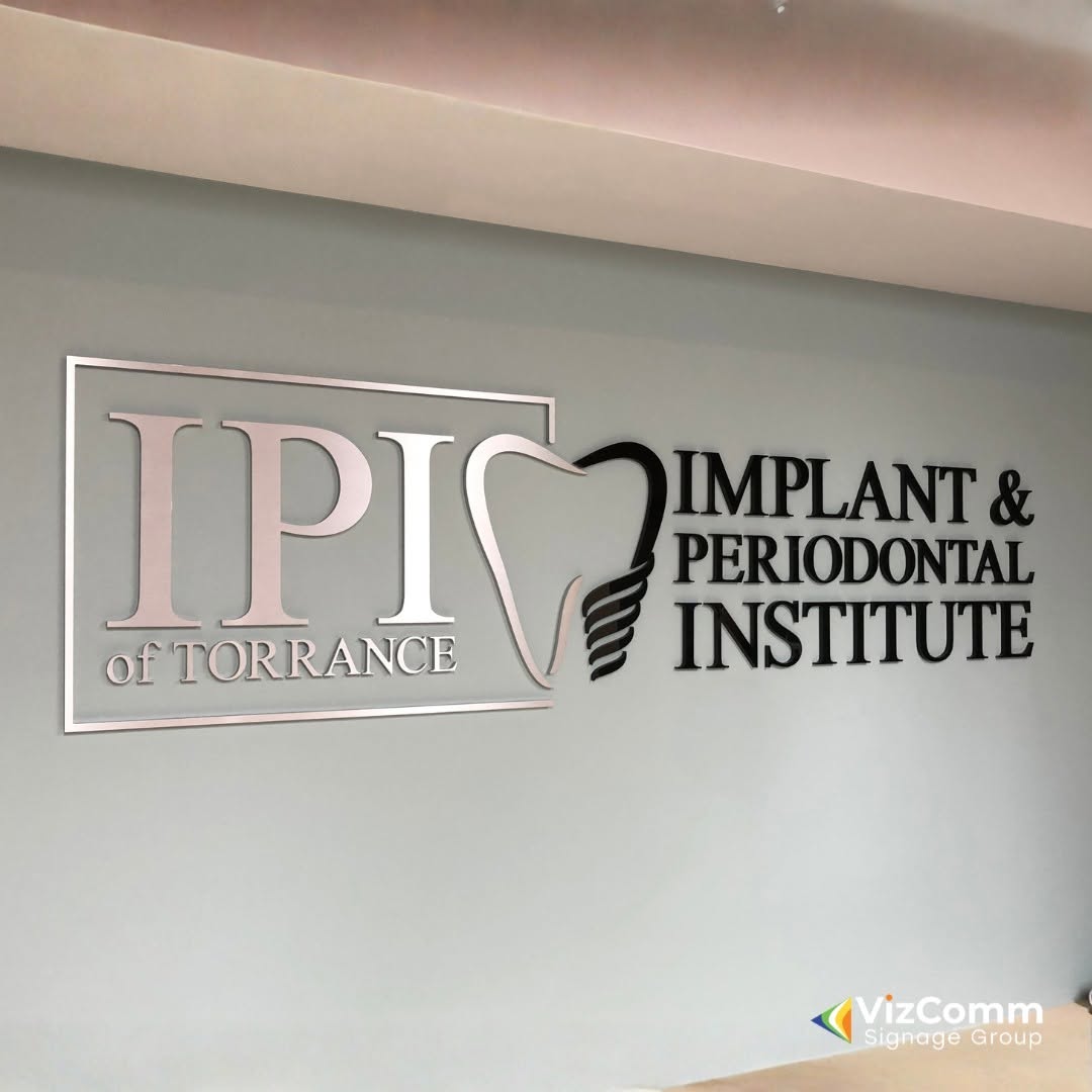
Much of that instant judgment comes from what is mounted on the wall. Lobby signs are the opening line of your company’s story, and visitors read it in about seven seconds.
The Silent Greeter Who Never Takes a Day Off
A receptionist works set hours, but your signage works every minute the doors are open. It greets the delivery driver, the job candidate, and the investor in exactly the same way.
That consistency is powerful. It means one well-made installation can shape thousands of first impressions without any extra effort from your team.
What Visitors Actually Notice
People rarely study a lobby. They absorb it in glances, and certain details register faster than others.
Clarity Comes First
Visitors want reassurance that they are in the right building. A clear name and logo answer that question immediately and lower the tension that comes with arriving somewhere new.
Quality Is Felt Before It Is Understood
Clean edges, even spacing, and tidy mounting all signal care. Crooked letters or visible glue marks send the opposite message, even if the visitor cannot say why the space feels off.
Three Questions Every Sign Should Answer
Before choosing a finish or a font, ask what the sign needs to accomplish. These three questions keep the project focused.
Who are we? The name and logo should be readable from the spot where guests first pause.
What are we like? Material, color, and lighting should hint at your personality, whether that is precise, playful, or rooted in tradition.
Where do I go next? The sign should sit in harmony with the desk and entryways so it supports movement rather than blocking it.
Designing for the Waiting Visitor
Most people see your lobby while waiting, which means they have time to look around. That gives you a chance to reward their attention.
Consider adding small layers of interest. A secondary line with your founding year, a tagline in a lighter weight, or a subtle texture behind the logo gives waiting guests something to discover.
Keep it modest, though. The main message should still be understood at a glance, with the finer details acting as a bonus.
Texture, Light, and Mood
Materials do more than hold a logo. They set an emotional temperature the moment someone walks in.
- Warm wood suggests approachability and craftsmanship.
- Polished metal feels precise and confident.
- Frosted glass adds calm and a sense of openness.
- Painted dimensional shapes bring energy and color without heaviness.
Lighting multiplies these effects. A soft glow behind letters creates a gentle halo, while a focused spotlight adds drama. Match the intensity to the mood your business wants to project.
The Camera Test
Your lobby sign will be photographed, and often. Candidates share pictures of interview day, partners snap photos for social media, and video calls sometimes happen right in front of the wall.
Before finalizing a design, view it through a phone camera. Check for glare, reflections, and how the logo looks when cropped. A sign that photographs well becomes free publicity that follows your visitors home.
Mistakes That Quietly Hurt the Result
Even strong ideas can stumble on small oversights. Watch for these common issues:
- Choosing a color that disappears against the wall paint
- Mounting the sign too high for comfortable viewing
- Crowding the logo with extra taglines and graphics
- Forgetting how the sign looks in the evening or on cloudy days
- Approving artwork without seeing a scaled mockup first
Planning Your Project Like a Pro
Good signage begins with measuring the wall, studying the lighting, and gathering high-resolution brand files. A partner who understands fabrication and installation can turn those basics into a smooth process. VizComm Signage Group is one example of a provider that helps organizations move from rough concept to finished installation.
Whoever you work with, request a mockup and ask about mounting methods. Knowing how the sign attaches to the wall also tells you how easily it can be updated later.
Keeping Your Sign in Top Shape
A sign that looks new in year five reflects well on the whole company. Dust it regularly with a soft, lint-free cloth and avoid harsh chemicals that can cloud acrylic or tarnish metal.
If your sign is illuminated, schedule a quick check every few months. Catching a dim section early prevents a mismatched glow later.
Final Thoughts
Your lobby is a stage, and the sign is the first thing under the spotlight. When it is clear, well crafted, and true to your brand, it earns trust before a single word is exchanged.
Treat it as a long-term asset instead of a decoration. A little planning now will keep your first impression strong for years.
Frequently Asked Questions
1. How big should a lobby sign be?
Size depends on the wall and the viewing distance. A good guideline is to leave generous empty space around the logo, so it feels balanced instead of cramped. A scaled mockup on your actual wall is the easiest way to confirm.
2. Are lobby signs worth the investment?
Yes, for most businesses. They influence every visitor’s first impression and serve as a long-lasting brand asset, often used daily for many years.
3. Should the sign be lit or non-lit?
Lit designs stand out in dim lobbies and add a premium feel. Non-lit versions work well in bright, naturally lit spaces, especially when paired with thoughtful accent lighting.
4. What file format do I need for my logo?
Vector files such as AI, EPS, or SVG are ideal because they scale without losing sharpness. If you only have a low-resolution image, a designer can usually recreate it cleanly.
5. Can I update the sign if my company moves or rebrands?
Often you can. Dimensional pieces can usually be removed and reused or replaced, though wall repair may be needed. Mentioning future plans during the design stage helps you pick the most flexible approach.