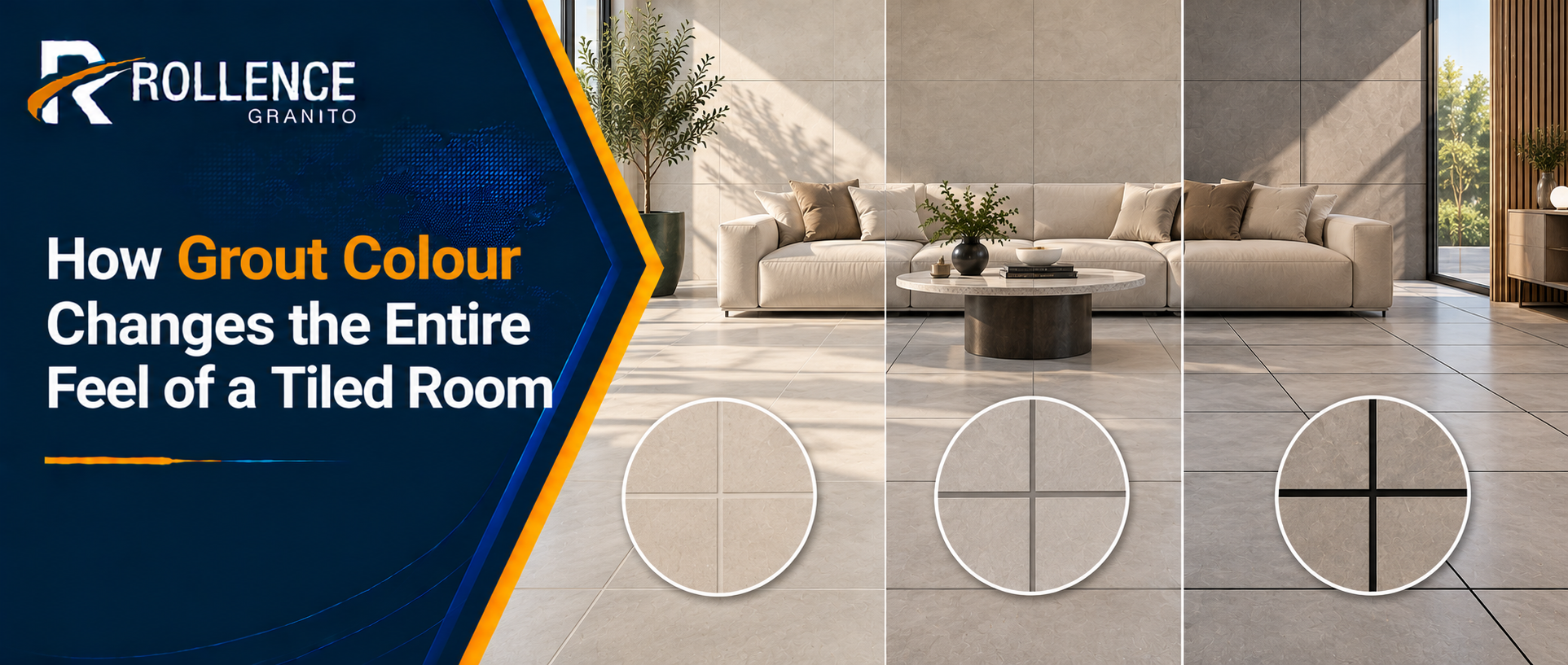
The tile gets chosen carefully. The grout is an afterthought. That sequence produces interiors where a well-specified porcelain tile is undermined by a grout colour that draws attention to every joint, segments the floor into a visible grid, or stains within six months. Grout colour is a design decision with as much impact on the finished result as the tile itself, and treating it as one changes the outcome.
Matching Grout to Tile: When Continuity Is the Goal
A grout colour that closely matches the body of the tile produces the most continuous surface reading. On a large format light grey porcelain floor from a 1200×1200 porcelain tiles manufacturer, a mid-grey grout with similar undertones causes the joints to recede visually. From standing height, the floor reads as an almost uninterrupted plane. This is the dominant specification preference in contemporary residential interiors, hospitality environments, and any space where the architecture relies on visual simplicity and spatial generosity to create its effect.

The match does not need to be exact. A grout that is one or two shades lighter or darker than the tile body reads as intentional rather than careless, and has the practical advantage of concealing the minor variation in grout joint colour that occurs as cement grout cures unevenly across a large floor area.
Contrasting Grout: When the Joint Becomes a Feature
A deliberate contrast between tile and grout shifts the visual effect entirely. Dark grout on light tiles, or light grout on dark tiles, emphasises the grid and makes the tile format itself part of the design language. This approach works well in geometric layouts, encaustic-style designs, and heritage interiors where the articulation of the tile pattern is the intended aesthetic. On a small bathroom floor in a fishscale or hexagonal mosaic, high-contrast grout makes the tile geometry legible and graphic. On a large open-plan floor, the same approach creates visual noise that fights the architecture rather than supporting it.

Grout Undertones and the Colour Temperature Problem
Grout colours are not neutral even when they appear to be. A white grout can carry warm yellow or red undertones, or cool blue and green ones. Placed against a tile with a different colour temperature, that undertone becomes visible and creates a clash that is obvious to the eye even if difficult to name. This is one of the most common sources of client dissatisfaction in tiled interiors. The fix is to assess grout samples against the actual tile under the lighting conditions of the installed space, not under showroom fluorescents. What reads as a clean match in the shop often reveals undertone conflict on site.
Staining Resistance and Colour Choice Over Time
Light grout in high-traffic areas or kitchens stains. This is not a failure of the grout product; it is a predictable consequence of using a porous light-coloured material in a contamination-heavy environment. Specifying a mid-tone or dark grout in kitchens, utility rooms, and heavily trafficked corridors is not a compromise on aesthetics; it is a maintenance decision that keeps the floor looking clean for years longer than a white or cream grout in the same location. Epoxy grout eliminates the staining problem entirely by being non-porous, and is worth the additional installation cost in any application where cleaning frequency is a genuine constraint.
Grout Width and Its Interaction With Colour
Narrow grout joints reduce the total surface area of exposed grout, which diminishes the visual impact of grout colour in either direction. A 1.5mm joint between rectified tiles from a quality manufacturer is barely perceptible regardless of colour. A 5mm joint on a standard calibrated tile is a significant visual element, and its colour matters proportionally more. This relationship means that the grout colour decision becomes progressively less critical as joint width decreases. On very large format tiles with near-invisible joints, the grout is a technical necessity rather than a design element, and matching it closely to the tile body is almost always the right specification.