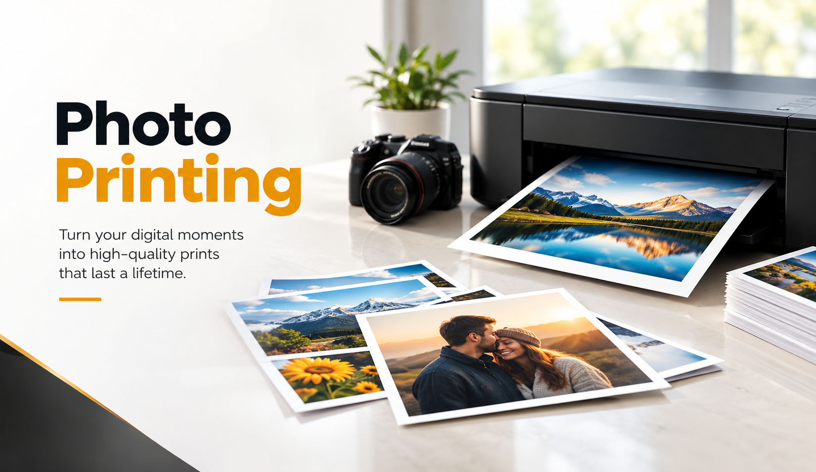
A photo might look sharp, colorful, and perfectly balanced on a computer screen, yet the printed version can tell a different story. Colors appear darker, important details disappear, or the final image looks slightly blurry. For businesses that rely on photographs to showcase products, promote services, or decorate commercial spaces, these small quality issues can affect the overall presentation.
We often find that people focus on choosing the right printer while overlooking the preparation that happens before printing. Image resolution, color settings, paper selection, and file formatting all influence the final result. Even a high-quality camera cannot compensate for poor print preparation.

Professional Photo Printing helps turn digital images into physical prints that preserve their detail and visual appeal. However, understanding a few practical printing principles can make the process smoother, reduce unnecessary reprints, and help businesses achieve more consistent results.
Why Digital Photo Printing Quality Matters for Businesses
Digital photographs play an important role in modern business communication. Restaurants display food photography, real estate agencies present property images, retailers use product photographs, and offices decorate their spaces with branded visuals. Each application requires attention to image quality and presentation.
A photograph with muddy colors or soft details can weaken an otherwise professional design. Customers may not consciously notice a minor printing problem, but they often recognize the difference between a carefully prepared image and one that lacks clarity.
The Difference Between Screen Quality and Print Quality
Computer screens produce images through illuminated pixels, while printers use ink or other imaging processes to reproduce colors on physical surfaces. These different methods explain why an image can look vibrant on a screen but appear darker or less saturated on paper.
Screen brightness also influences how we judge photographs. A bright monitor can make an underexposed image appear acceptable, even though the printed version may reveal dark shadows and limited detail.
Before approving an important printing project, we recommend viewing photographs on a reasonably calibrated monitor and checking the image at a realistic print size. This simple habit can help identify problems before they affect an entire order.
How Print Quality Influences Brand Presentation
Businesses often invest considerable time in photography, lighting, and visual design. Poor printing can undermine that work, particularly when the images appear in customer-facing environments.
For example, a restaurant may invest in professional food photography but choose a printing method that produces inaccurate colors. The finished display might make fresh ingredients look dull or change the appearance of carefully prepared dishes.
Consistent photo reproduction helps businesses maintain a recognizable visual identity across marketing displays, framed photographs, portfolios, and promotional materials.
Choose the Right Image Resolution for Sharp Photo Prints
Image resolution remains one of the most important factors in digital photo printing. A photograph needs enough pixels to reproduce fine details at its intended physical size.
Many printing problems begin when someone enlarges a small image beyond its practical limits. The image may look acceptable as a thumbnail, but the final print can reveal jagged edges, soft textures, or visible pixelation.
Understanding DPI and PPI in Photo Printing
People often use DPI and PPI interchangeably, although they describe different concepts. PPI, or pixels per inch, measures the density of image pixels at a particular print size. DPI, or dots per inch, refers to how a printer places physical dots during printing.
For many standard photographic prints, approximately 300 PPI provides a useful target for fine detail. Larger prints that viewers see from a greater distance may work well at lower effective resolutions, depending on the image and output process.
| Print size | Approximate pixel dimensions at 300 PPI |
|---|---|
| 4 × 6 inches | 1200 × 1800 pixels |
| 5 × 7 inches | 1500 × 2100 pixels |
| 8 × 10 inches | 2400 × 3000 pixels |
| 11 × 14 inches | 3300 × 4200 pixels |
| 16 × 20 inches | 4800 × 6000 pixels |
These dimensions serve as useful preparation targets rather than strict requirements. A professional print provider can assess whether a lower-resolution image will still produce acceptable results at the desired size.
Avoid Enlarging Low-Resolution Images Unnecessarily
One common mistake involves downloading an image from a website and using it for a large printed display. Websites frequently compress images to improve loading speed, which can reduce their suitability for printing.
Increasing an image’s dimensions does not automatically restore missing detail. Modern image enhancement tools can improve certain photographs, but they cannot reliably recreate every original texture or feature.
We recommend requesting the original camera file whenever possible. If the project requires a large enlargement, examine the image at the intended dimensions before committing to production.
Adjust Image Colors for More Accurate Photo Printing
Color differences create some of the most frustrating problems in digital printing. A photograph may contain the correct composition and resolution but still produce disappointing results when the colors shift during printing.
Good color preparation helps preserve natural skin tones, product colors, and important visual details. Businesses should pay particular attention to photographs that must match an established brand identity.
Understand RGB and CMYK Color Modes
Digital cameras and computer screens commonly use RGB color, which combines red, green, and blue light. Many commercial printing processes use CMYK inks, although photographic printers may rely on specialized ink sets and color-management workflows.
Converting every photograph to CMYK before printing is not always the best approach. Some photo printing systems work more effectively with RGB image files and apply printer-specific color profiles during production.
We recommend asking the printing provider which color space and file settings they prefer. This avoids unnecessary conversions that could reduce color accuracy.
Calibrate Your Monitor Before Editing Photos
An overly bright or poorly adjusted monitor can lead to inaccurate editing decisions. Someone may darken an image unnecessarily because the display makes it appear too bright, or increase saturation because the monitor produces muted colors.
A calibrated display helps create a more dependable reference for editing. For color-sensitive projects, hardware calibration offers greater consistency than relying entirely on visual adjustments.
Even with a calibrated monitor, paper characteristics and lighting conditions can affect the final appearance. Reviewing a physical proof remains valuable when accurate color reproduction matters.
Avoid Excessive Brightness and Saturation Adjustments
Heavy editing can make photographs look unnatural in print. Excessive contrast may remove details from shadows, while aggressive sharpening can introduce visible outlines around objects.
We generally recommend subtle corrections that preserve the original character of the photograph. Check skin tones, neutral backgrounds, highlights, and darker areas before exporting the final file.
Product photographs deserve particular care. Customers expect printed colors to resemble the actual items, especially when businesses promote clothing, furnishings, cosmetics, or decorative products.
Select the Best Photo Paper for Your Printing Project
Paper selection influences how photographs look and feel. Two prints can use the same image file yet produce noticeably different results because their paper surfaces interact differently with light and color.
The best paper depends on the photograph, display environment, budget, and intended purpose. Rather than choosing the most expensive option automatically, we encourage businesses to consider where and how people will view the finished prints.
Glossy Photo Paper for Vibrant Colors
Glossy paper creates a reflective surface that often emphasizes rich colors, contrast, and fine photographic details. It works particularly well for colorful product images, travel photography, and photographs that benefit from a lively presentation.
However, glossy surfaces can show fingerprints and reflections more easily. Strong overhead lighting may also create glare that distracts viewers from the photograph itself.
For displays near windows or bright lighting fixtures, we recommend considering whether reflections will affect visibility before selecting a glossy finish.
Matte Photo Paper for a Refined Appearance
Matte paper offers a softer, less reflective surface. Businesses often choose this finish for artistic photography, professional displays, and images that require comfortable viewing under varied lighting conditions.
Matte finishes can also reduce the visibility of fingerprints, which helps when people frequently handle the prints. However, some matte surfaces produce less apparent contrast or color intensity than glossy alternatives.
For professional portfolios, office displays, or framed photography, matte paper can create a restrained appearance that complements the surrounding environment.
Luster and Satin Finishes for Balanced Results
Luster and satin papers offer a practical middle ground between glossy and matte finishes. Their subtle texture can help reduce glare while maintaining attractive color reproduction and image detail.
These surfaces often suit portraits, event photographs, and professional photographic portfolios. They also provide an alternative when clients want a polished appearance without the strong reflections of glossy paper.
We recommend comparing actual paper samples when the project involves important photographs. Seeing the finishes in person makes the selection process much easier than relying on digital descriptions alone.
Prepare Your Photo Files Before Sending Them to Print
Proper file preparation can prevent unexpected delays, unnecessary revisions, and disappointing prints. A photograph may have sufficient resolution and accurate colors but still encounter problems because of incorrect dimensions, compression, or cropping.
A clear preparation process also helps printing teams understand the expected result. This becomes especially important when businesses order multiple sizes or reproduce photographs across different materials.
Choose the Right File Format
JPEG works well for many everyday photographs, particularly when the file maintains high quality and sufficient resolution. It offers manageable file sizes and broad compatibility across common printing workflows.
TIFF can provide advantages for projects that require lossless image preservation or extensive editing. PNG also supports lossless compression, but it does not automatically produce better photographic prints than a properly prepared JPEG.
We recommend preserving a high-quality master image and creating separate export files for specific printing requirements. Avoid repeatedly saving and recompressing JPEG files during editing.
Check Cropping and Aspect Ratio
Different print sizes use different aspect ratios. A standard 4 × 6 photograph has a 3:2 ratio, while an 8 × 10 print uses a 4:5 ratio.
When the image ratio does not match the selected paper size, the printer must either crop part of the photograph or add borders. This can create problems when important details sit close to the edges.
For example, a group photograph may lose someone near the edge if the file does not accommodate the desired print dimensions. We recommend previewing the crop at the exact output ratio before submitting the image.
Leave Enough Space Around Important Details
Photographs intended for framing or mounting may require additional consideration around their edges. Frames and mounting systems sometimes cover a small portion of the image.
Keep faces, product labels, and other essential visual elements away from areas that framing or trimming might conceal. If the printing provider requires bleed or specific trimming allowances, follow those instructions rather than guessing.
A small adjustment to the composition can prevent important content from disappearing during finishing.

Improve Digital Photo Printing with Better Image Editing
Editing should enhance the photograph without making it appear artificial. Strong print preparation usually involves careful adjustments to exposure, contrast, color balance, and sharpness rather than applying dramatic effects.
Business photographs often serve a specific communication purpose. Product images should represent merchandise accurately, while portraits should retain natural skin tones and recognizable facial details.
Correct Exposure and White Balance
Exposure determines how bright or dark a photograph appears. Before printing, review the highlights and shadows to ensure important details remain visible.
White balance affects the overall color temperature. Incorrect settings can make white backgrounds appear yellow, blue, or green, which becomes especially noticeable in product photography.
We recommend checking neutral areas first and making gradual adjustments. Natural-looking corrections often produce more useful results than heavily stylized edits.
Apply Sharpening Carefully
Sharpening can improve the apparent clarity of photographs, but excessive sharpening creates distracting artifacts. It may exaggerate skin texture, produce halos around objects, or introduce unwanted noise.
The appropriate sharpening level depends on image resolution, print dimensions, viewing distance, and paper characteristics. A small photograph may require different adjustments than a large wall display.
Whenever possible, review a test print before applying strong sharpening settings to an entire collection of photographs.
Remove Unnecessary Distractions
Dust spots, sensor marks, distracting background objects, and small imperfections can become more noticeable after enlargement. Reviewing these details before printing can improve the finished presentation.
However, excessive retouching can make products look misleading or portraits appear unnatural. Businesses should aim for clean, accurate photographs that represent the subject appropriately.
We encourage editors to examine images at both normal viewing size and close magnification. This helps identify technical problems without losing sight of the overall composition.
Common Digital Photo Printing Mistakes to Avoid
Many print quality problems come from simple decisions rather than complicated technical failures. Businesses can prevent a large portion of these issues by introducing a consistent review process before placing an order.
We often recommend checking the image source, dimensions, color appearance, and paper choice together instead of treating them as separate tasks.
Printing Directly from Social Media Images
Social media platforms commonly resize or compress uploaded photographs. Downloading an image from a social media post may produce a file with less detail than the original photograph.
For small prints, the quality might remain acceptable. However, larger prints can expose compression artifacts, blurry edges, and missing textures.
Use the original camera image or a high-quality export whenever possible. This gives the printing process more image information to work with.
Choosing Print Size Without Checking Resolution
Business owners sometimes select print dimensions based entirely on available display space. While physical size matters, image resolution determines whether the photograph can support that enlargement.
Before ordering a large print, compare the original pixel dimensions with the intended output size. If the image lacks sufficient detail, consider a smaller print or a better source photograph.
This simple check can prevent the disappointment of receiving a large print that looks noticeably softer than expected.
Skipping Proofs for Important Projects
A digital preview cannot reproduce every characteristic of a physical print. Paper texture, ink behavior, lighting, and finishing choices can influence the final appearance.
For important presentations, multiple-copy orders, or color-sensitive product displays, a printed proof can help identify problems before full production.
We recommend reviewing the proof under lighting similar to the intended display environment. This creates a more realistic expectation of how customers will see the finished photograph.
How Businesses Can Use High-Quality Printed Photos
Printed photographs still support many practical business activities, even as digital marketing continues to expand. Physical images give customers something tangible to view, handle, or display.
Interest in printed images also extends beyond traditional photo albums. Younger consumers increasingly explore physical photography, personal keepsakes, and creative displays, a trend discussed in this article about Gen Z and printed photos.
Retail Displays and Product Presentations
Retail businesses can use professional photographic prints to communicate product details, seasonal themes, and brand personality. Clear images help shoppers understand products without relying entirely on lengthy descriptions.
For example, a furniture store might display room photography to show how pieces work together. A beauty retailer may use close-up photographs to communicate packaging details or product appearance.
The printing approach should reflect the environment. Images that customers examine closely require careful attention to sharpness, cropping, and color consistency.
Office Interiors and Professional Portfolios
Offices, studios, and service businesses frequently use framed photography to create welcoming spaces and communicate their work. Architects, designers, photographers, and real estate professionals also rely on printed portfolios during client presentations.
A carefully selected paper finish can complement the setting without distracting from the photograph. Consistent sizing and framing also help create a cohesive display.
We recommend selecting a small group of strong photographs rather than filling every available space. Good presentation often benefits from restraint.
Events, Exhibitions, and Client Materials
Businesses use photographs for trade shows, conferences, exhibitions, and client presentations. These projects may require consistent results across different print dimensions and display formats.
Preparing all images with a shared color-management approach helps reduce noticeable differences between individual prints. It also makes future reorders easier when businesses need additional materials.
For exhibitions, consider viewing distance and lighting before choosing the final dimensions and finish. A print that works well on an office wall may need different preparation for a brightly illuminated event space.
Practical Tips for Choosing a Professional Photo Printing Service
A reliable printing process involves more than equipment. Clear communication, suitable materials, file preparation, and quality checks all contribute to the outcome.
Before placing an order, businesses should explain how they intend to use the photographs. A printing provider can then help identify suitable dimensions, finishes, and file requirements.
Ask About Paper Options and File Requirements
Different printing services support different photographic papers, color profiles, and production methods. Understanding these options before submitting files can prevent avoidable mistakes.
We recommend asking which file format the provider prefers, whether they offer color-managed printing, and which paper surfaces suit the project.
For important photographs, request samples when available. Comparing physical materials can reveal differences that online previews cannot communicate.
Discuss Turnaround Times and Finishing Needs
Printing schedules can vary depending on the number of photographs, dimensions, materials, and finishing requirements. Framing, mounting, or specialty paper choices may influence production time.
Businesses working toward an event or presentation deadline should communicate their schedule early. This provides room for necessary adjustments or proof reviews.
We also recommend confirming the final dimensions, quantities, and finishing instructions in writing. Clear specifications reduce confusion and help prevent unnecessary reprints.
Review a Sample Before Large Orders
When a project requires numerous prints, approving one representative sample can save time and materials. The sample should reflect the intended paper, size, and production settings.
Check the image under realistic viewing conditions and pay attention to skin tones, shadow detail, sharpness, and cropping.
Once the sample meets expectations, retain the approved settings for consistency during production and future reorders.
Frequently Asked Questions
1. What is the best resolution for high-quality photo printing?
For many standard photographs, 300 PPI at the final print size provides a useful target for sharp detail. However, larger prints that viewers examine from farther away can often use lower resolutions successfully. We recommend checking the original image dimensions before selecting a print size, especially for detailed photographs or professional displays.
2. Is glossy or matte paper better for digital photo prints?
The better choice depends on how and where people will view the photograph. Glossy paper often emphasizes vibrant colors and contrast, while matte paper reduces glare and offers a softer appearance. We recommend considering lighting, handling, and presentation style before choosing a finish. Luster paper can offer a useful balance between the two.
3. Why do printed photos look darker than they do on a screen?
Computer monitors emit light, while printed photographs reflect surrounding light. A monitor with high brightness can make images appear lighter than their printed versions. Incorrect color settings and unsuitable paper choices may also contribute. We recommend adjusting monitor brightness, checking exposure, and requesting a proof for color-sensitive projects.
4. Which image file format produces the best photo prints?
High-quality JPEG files work well for many standard photo printing projects, provided they contain sufficient resolution and minimal compression artifacts. TIFF can offer advantages for lossless storage and demanding editing workflows. We recommend keeping the original high-resolution file and following the printing provider’s preferred file specifications.
Conclusion: Better Photo Prints Begin with Better Preparation
High-quality digital photo printing starts with thoughtful preparation. Image resolution, color accuracy, paper selection, cropping, and file formatting all influence how a photograph appears once it leaves the screen.
We encourage businesses to approach printing as part of their overall visual presentation rather than a final production step. Checking original files, selecting appropriate materials, and reviewing proofs can prevent common mistakes while improving consistency across different projects.
At Laguna Digital, businesses and individuals can explore professional printing options for photographs and other visual materials. Whether the goal involves a small collection of personal photographs or images for a commercial display, discussing the intended use and technical requirements with a printing specialist can help produce a result that meets practical expectations.
Before starting your next project, review the image quality, consider the viewing environment, and choose printing options that suit the photograph. A little preparation can make a meaningful difference in the finished print.